
Open CKey FindingsOCF-2026-000001Version 1
Rendered readability of CKey designs on screens: tone, contrast, vignettes, mark shape and the room around the display
- 1Open CKey Project
- Submitted
- Published
- Licence
- CC BY 4.0
Keywords CKey; optical codes; screen display; luminance contrast; vignette; mark shape; CIEDE2000; design guidance
Editorial finding · 3,126 words
Abstract
We studied how the visual design of a CKey symbol shown on a screen affects how reliably a phone camera can read it. We compared colour pairs, luminance contrast, background vignettes and mark shapes. The evidence comes from two places: field observations with an iPhone and two consumer displays, and a controlled simulation. The simulation draws each symbol with the reference CKey renderer and reads it with the reference decoder, through a modelled camera with auto-exposure, blur and sensor noise. Three results stand out. First, the vignettes common to the best-reading published designs have no measurable effect of their own: on dark-background designs, readability is identical with and without one. Second, readability depends strongly and symmetrically on the brightness of the scene around the display. Light-background designs fail when the room is much darker than the screen, and dark-background designs fail when the room is as bright as the screen or brighter. Across the two standard designs, failures appeared once the ratio between the symbol's background luminance and the dominant scene luminance reached about 30:1. Third, no single design read in all five simulated rooms. Contrast can be softened from 21:1 to about 14–16:1 with little loss and changes that are hard to see, but 12:1 was noticeably worse. Mid-grey backgrounds and vignettes that fade to a contrasting edge make things worse. We give practical rules for choosing designs for screens and print, the mathematics behind them, and the limits of the evidence.
Introduction
A CKey symbol is a two-dimensional optical code. A rounded square frame with four corner finders surrounds a field of square modules on the outside, and rings and radial rays in the centre. Like other matrix codes, it can be styled: the background, ink and accent colours, a radial background vignette, a metallic sheen on the ink, and the shape of the modules (rounded square, square, circle or diamond). The published design catalogue at openckey.org offers about twenty such designs, each certified by a modelled scan before publication.
In informal use on displays, some designs read from much further away than others, and the pattern was not explained by contrast alone. The best-reading designs shared visible traits: several have a dark, vignetted background, and one light design (Plum) uses round marks and an accent colour. This paper asks which of these traits actually matter for readability on screens, why, and what a designer should do about it.
We deliberately keep to the rendered symbol and its environment: colours, tone, shape and surroundings. Decoding software differs between readers and changes over time. Where a result depends on how a reader judges dark and light, we say so in general terms (Section 5.3), but we do not evaluate particular readers.
Background
Relative luminance and contrast ratio
Displays and image files encode colour in sRGB. Perceived tone and camera exposure act on linear light, so every quantity below is computed after the sRGB transfer function is undone [1]. For an 8-bit channel value :
and the relative luminance of a colour is
The contrast ratio between two colours with luminances is the familiar web-accessibility measure [2]:
which runs from 1:1 (identical) to 21:1 (black on white).
How visible a change of tone is
To ask whether a design "still looks like" black on white after softening, we use the CIEDE2000 colour difference [3]. For neutral greys the chroma and hue terms vanish and reduces to a weighted lightness difference:
where is CIELAB lightness and is the mean of the two. As a rule of thumb, a below about 1–2 is hard to see in isolation, and 2–4 is visible mainly when the two are side by side.
Frame-referenced and local tone decisions
To find a symbol, a reader has to decide which pixels are dark and which are light. A simple, fast and widely used approach takes one reference from the brightness distribution of the whole camera frame: a global threshold, as in Otsu's method [4], or a percentile rule. Local methods instead judge each pixel against its own neighbourhood [5]. Local methods cost more computation, but they are insensitive to what lies elsewhere in the frame. Section 5.3 shows that this distinction explains most of what follows.
Methods
Field observations
The field observations were made by the author over one evening on 2026-11-08. The setup:
- an iPhone running the Open CKey Scanner app;
- the codes shown on an older Samsung television and on a lower-resolution computer monitor, in an indoor room lit more dimly than the screens;
- every symbol a CKey Profile 0, version 1 code carrying the 20-byte payload
https://openckey.org, rendered by openckey.org at its default on-screen size of about 10 cm (4 in).
For each design, the author recorded roughly the greatest distance at which the code read reliably. These observations are uncontrolled: viewing angle, hand motion and exposure varied, and the app's software changed during the evening. We therefore compare designs only within one sitting, never across sittings, and treat the distances as ordinal.
Controlled contrast series
To separate background tone from ink tone, the author tested five neutral-grey candidates with otherwise identical settings (round marks, same size, same display and position). For each, they recorded the furthest distance that read on three of three attempts, and whether reading was immediate or slow.
Simulation
To isolate one variable at a time, we built a minimal screen-and-camera model around the reference CKey renderer and decoder (core version 0.1.0-build.85).
- Rendering. The symbol is rendered with the design's style (colours, vignette, sheen, accents, mark shape) at four times the target width, then area-averaged to the target width in camera pixels, with a random sub-pixel phase. Luminance is computed in linear light as above.
- Scene. The symbol sits in the middle of a uniform screen page (linear luminance 0.92, the cream of the openckey.org page), on a side. The page sits in a uniform room that fills the rest of a frame, so the room covers three quarters of the view. Room luminance is the main independent variable: 0.03 (a dim room), 0.10, 0.25, 0.50 and 0.90.
- Camera. Auto-exposure scales the frame so its mean is 0.18 (mid-grey), as phones do when metering the whole scene. Values above 1.0 clip. The optics are a Gaussian blur with px. The sensor adds photon noise (variance ) and read noise (). The result is gamma-encoded to 8 bits.
- Reading. The reference decoder looks for the symbol in the whole frame, fits its outline and decodes it. A read counts only if the full 20-byte payload comes back, so its Reed–Solomon and CRC-32C checks passed.
- Measure. For each design and room, steps from 40 to 130 px in 6 px increments, with 12 trials per step. Each trial has a different noise seed and sub-pixel phase. The read floor is the smallest at which at least 9 of 12 trials read. Smaller is better, and "no read" means no size up to 130 px met that bar. A 130 px code here has about 4.2 camera pixels per module.
The model does not include the display's pixel structure (sub-pixels, moiré), viewing angle, rolling shutter or motion. It is a model of tone and exposure, not of the whole optical chain. The source of the model is published alongside this paper (see Data and code).
Results
Field observations by design
Table 1. Published designs observed in the field (same sitting, same display), with their luminance contrast. Distances are approximate and ordinal.
| Design | Background | Ink | Contrast | Vignette | Marks | Observed reading |
|---|---|---|---|---|---|---|
| Paper on Teal | dark teal | paper white | 9.0:1 | yes | rounded square | many distances, reliable |
| Ocean | deep blue-green | sea-foam | 10.8:1 | yes | rounded square | many distances, reliable |
| Midnight | deep navy | ivory | 14.9:1 | yes | rounded square | many distances, reliable |
| Plum | blush white | plum | 13.4:1 | no (accent) | circle | many distances |
| Graphite | cool grey | graphite | 13.3:1 | no | square | about 30–36 cm, less reliable |
| Teal on Paper | paper | deep teal | 12.8:1 | no | rounded square | about 30 cm |
| Navy on Paper | paper | navy | 16.2:1 | no | rounded square | about 30 cm |
| Lagoon | warm white | mid teal | 5.2:1 | no | circle | about 15 cm |
| Plain | white | black | 21.0:1 | no | rounded square | about 5–10 cm |
Two patterns are visible. Every design with a dark background read well, and every dark-background design in the catalogue also has a vignette. Among light designs, readability does not rise with contrast: Plain, at the maximum 21:1, read worst.
Controlled contrast series
Table 2. Neutral-grey candidates with round marks. Contrast from Section 2.1; from pure white and pure black respectively.
| Candidate | Background (RGB) | Ink (RGB) | Contrast | bg / ink | Field result |
|---|---|---|---|---|---|
| A | 246, 246, 246 | 28, 28, 28 | 15.8:1 | 1.8 / 6.1 | like D |
| B | 246, 246, 246 | 36, 36, 36 | 14.4:1 | 1.8 / 8.7 | like D |
| C | 248, 248, 248 | 43, 43, 43 | 13.3:1 | 1.4 / 10.9 | like D, less reliable |
| D | 242, 242, 242 | 36, 36, 36 | 13.9:1 | 2.6 / 8.7 | reliable to about 60 cm, only square-on |
| E | 238, 238, 238 | 44, 44, 44 | 12.0:1 | 3.5 / 11.2 | to about 40 cm, slow and unreliable |
Softening from 21:1 to the 14–16:1 range (A, B, D) produced backgrounds within about 2 of white, which look plain in isolation, and gave no loss. At 12:1 (E), readability was clearly worse. Once the phone was held square-on, Plain itself behaved like A, B and D. Viewing angle, not contrast, had been the main uncontrolled variable in Table 1's light-design results. Changing Plain's rounded-square marks to round marks increased its distance from about 5–10 cm to about 25 cm in the earlier, angle-uncontrolled sitting. This hints that mark shape interacts with the display's pixel grid (Section 6), a factor the simulation does not model.
Vignettes do not matter by themselves
Table 3. Simulated read floor (px; smaller is better) with a dim room (0.03), with and without a vignette. Every other setting is identical.
| Design | Without vignette | With vignette |
|---|---|---|
| Midnight (navy, ivory ink) | 100 | 100 |
| Paper on Teal (teal, paper ink) | 94 | 94 |
| Plain (white, black ink) | no read | 118 (white to grey edge) |
| Plum (blush white, round marks) | no read | not tested |
On both dark designs, a vignette changes nothing. Its apparent benefit in Table 1 is a confound: in the catalogue, vignette and dark background always come together. On Plain, a vignette that darkens the edge to grey makes an unreadable code readable, but only marginally (118 px). We show next that this works by changing the frame's brightness distribution, not because a vignette is good in itself. Adding accents, or switching Plum's round marks to rounded squares, made no difference in the simulation (all three Plum variants: no read).
The room around the display
Table 4. Simulated read floor (px) against room brightness. The screen page is 0.92 throughout.
| Room luminance | 0.03 | 0.10 | 0.25 | 0.50 | 0.90 |
|---|---|---|---|---|---|
| Plain (light) | no read | 124 | 100 | 94 | 112 |
| Plum (light, round, no accent) | no read | 124 | 106 | 94 | 112 |
| Midnight (dark) | 100 | 106 | 124 | no read | no read |
Figure 1. Read floor against room brightness for a light and a dark design (data in Table 4). Hollow markers in the top band are rooms in which the design did not read at any size up to 130 px.
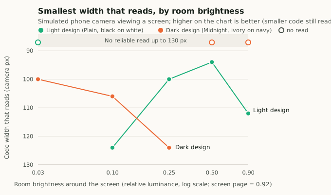
The dependence is strong and symmetric. Light designs fail when the room is much darker than the screen. Dark designs fail when the room is as bright as the screen or brighter, and they read best in a dark room. Changing the brightness of the screen page around the symbol (from 255 down to 40 in 8-bit grey) did not rescue Plain in a dim room. What matters is the tone that dominates the camera frame, not the tone just around the code.
A single number describes both standard designs. Let be the luminance of the symbol's background and the luminance that dominates the frame (here, the room). Define the background-to-scene ratio
| Read floor | ||
|---|---|---|
| Plain, room 0.03 | 33 | no read |
| Plain, room 0.10 | 10 | 124 px |
| Plain, room 0.25 | 4 | 100 px |
| Plain, room 0.50 | 2 | 94 px |
| Midnight, room 0.03 | 2.3 | 100 px |
| Midnight, room 0.10 | 7.7 | 106 px |
| Midnight, room 0.25 | 19 | 124 px |
| Midnight, room 0.50 | 38 | no read |
Both designs read best at below about 5, degrade from about 10 to 20, and fail at about 30 or more. In plain terms: the symbol's background should be within about an order of magnitude of the brightness of the scene the camera sees.
No design reads in every room
Table 5. Simulated read floor (px) for candidate designs across rooms. "–" means no read up to 130 px.
| Design | 0.03 | 0.10 | 0.25 | 0.50 | 0.90 |
|---|---|---|---|---|---|
| Plain (white, black) | – | 124 | 100 | 94 | 112 |
| Midnight (navy, ivory) | 100 | 106 | 124 | – | – |
| Dark grey #404040, white ink | 94 | 100 | 118 | – | – |
| Mid-grey #6a6a6a, white ink | 94 | 94 | 100 | – | – |
| Light grey #d0d0d0, black ink | 124 | 106 | 94 | – | – |
| Mid-grey #8a8a8a, black ink | 94 | – | – | – | – |
| White, vignette to black edge | – | – | – | – | – |
| White, vignette to dark grey edge | – | – | – | – | – |
| Navy, vignette to a light edge | – | – | – | – | – |
None of the nine designs read in all five rooms. Plain covered the widest range (four of five rooms). Dark designs covered the three darker rooms. Mid-tone backgrounds did not straddle both regimes. They shifted where failure occurs, and with black ink they did worse than either extreme, so alone does not describe them: ink polarity matters too. Vignettes that fade to a contrasting edge never read, in any room.
Discussion
Why the published dark designs read so well on screens
Screens are usually brighter than the rooms they sit in, especially indoors in the evening. A camera that meters the whole scene then exposes for the room, and a light symbol's background ends up far brighter than the scene around it, with large . A dark-background design keeps small in exactly those conditions. That, not the vignette, is why the vignetted designs topped Table 1. The same reasoning predicts that in a bright room, or in daylight, the dark designs would be the ones to fail. Table 5 confirms this in simulation.
Why softening contrast helps only a little
Maximum contrast does not hurt readability in itself. Once viewing angle was controlled, Plain matched the softened candidates (Table 2). Softening to 14–16:1 is harmless and nearly invisible, since a background of 246 is 1.8 from white. It gives a little headroom against clipping on bright displays. Going below about 13:1 costs reliability. The useful band for screen designs is therefore about 14–16:1, with 13:1 as a floor.
What this implies for readers
The pattern in Tables 4 and 5 is what one expects when dark and light are judged against the brightness distribution of the whole frame (Section 2.3). When most of the frame is a room much darker or brighter than the symbol's background, a whole-frame reference sits in the wrong place for the symbol. When we repeated the simulation reading only the symbol and a margin of one third of its width around it, every design in Table 4 read in both the dark room (Plain and Plum from 94 px, Midnight from 100 px) and the bright room (106 to 118 px).
This is a property of how a reader references tone, not of the symbol. A reader that judges tone locally, or reads a region of interest around the code, removes most of the dependence on the room, and with it most of the advice that follows. Until such readers are universal, design choices can compensate.
Practical guidance
- Match the background to the scene. For codes that will mostly be shown on screens viewed indoors, prefer a dark background with light ink. For print, and for screens in bright places, prefer a light background with dark ink. Aim for a background-to-scene ratio below about 10. Above about 30, expect failure with readers that reference the whole frame.
- Do not rely on mid-greys to cover both cases. In our tests they narrowed the working range rather than widening it.
- Keep contrast between about 14:1 and 16:1 for screen designs, and above 13:1 in any case. Neutral pairs such as background (246, 246, 246) with ink (28, 28, 28) look like plain black on white and gave full readability.
- Treat vignettes as decoration. They neither help nor hurt a dark design. Never fade a light background to a dark edge, or a dark one to a light edge: every such design in Table 5 failed in every room.
- Accents and mark shape: accents had no measurable effect in our tone model. Round marks may help on displays, where they appeared to reduce failures in the field, but this needs a controlled test that includes the display's pixel structure.
- For print, keep maximum contrast. Paper does not emit light: it sits at about the brightness of its surroundings, which keeps small, and lower contrast only costs margin in poor light.
Limitations
The field observations come from one observer, one phone, two displays and one evening. Distances were estimated and conditions were not fully controlled. The simulation models tone, exposure, blur and noise only: no display sub-pixels or moiré, no viewing angle, no motion. Its absolute numbers (read floors in pixels) belong to the model and should not be read as distances. Only Profile 0 version 1 with one payload was tested, and with one reference decoder version; denser versions have finer marks and may respond differently. The background-to-scene ratio is an empirical descriptor fitted to two high-contrast designs, and mid-tone designs did not follow it. We welcome replications, especially field measurements in bright rooms and daylight, through the field-test programme at openckey.org.
Data and code
- Simulation: the parameters are as stated in Section 3.3. The C++ source of the simulation, which links the reference CKey core, is published at openckey.org/findings/supplementary/ocf-2026-001-simulation.cpp.
- Reproducibility: the random seeds are fixed per size step, so the published tables are reproducible exactly with core version 0.1.0-build.85.
- Design colours: the colours of every published design are in the openckey.org design catalogue.
References
- International Electrotechnical Commission. IEC 61966-2-1:1999. Multimedia systems and equipment: Colour measurement and management, Part 2-1: Default RGB colour space, sRGB. 1999.
- World Wide Web Consortium. Web Content Accessibility Guidelines (WCAG) 2.1, definitions of relative luminance and contrast ratio. W3C Recommendation, 2018. https://www.w3.org/TR/WCAG21/
- Sharma, G., Wu, W., and Dalal, E. N. "The CIEDE2000 color-difference formula: Implementation notes, supplementary test data, and mathematical observations." Color Research & Application 30(1), 21–30, 2005.
- Otsu, N. "A threshold selection method from gray-level histograms." IEEE Transactions on Systems, Man, and Cybernetics 9(1), 62–66, 1979.
- Sauvola, J., and Pietikäinen, M. "Adaptive document image binarization." Pattern Recognition 33(2), 225–236, 2000.
How to cite
Citation
Caleb Owen (2026). Rendered readability of CKey designs on screens: tone, contrast, vignettes, mark shape and the room around the display. Open CKey Findings, OCF-2026-000001 (Version 1). https://findings.openckey.org/p/rendered-readability-of-ckey-designs-on-screens
BibTeX
@misc{ocf2026000001,
  author       = {Caleb Owen},
  title        = {{Rendered readability of CKey designs on screens: tone, contrast, vignettes, mark shape and the room around the display}},
  year         = {2026},
  howpublished = {Open CKey Findings},
  number       = {OCF-2026-000001},
  version      = {1},
  url          = {https://findings.openckey.org/p/rendered-readability-of-ckey-designs-on-screens},
  note         = {Licensed under CC BY 4.0}
}